|
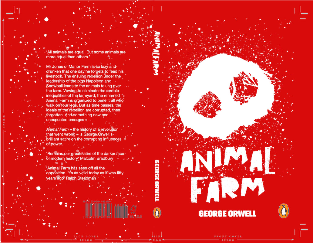
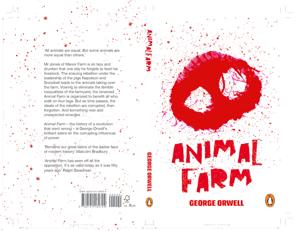
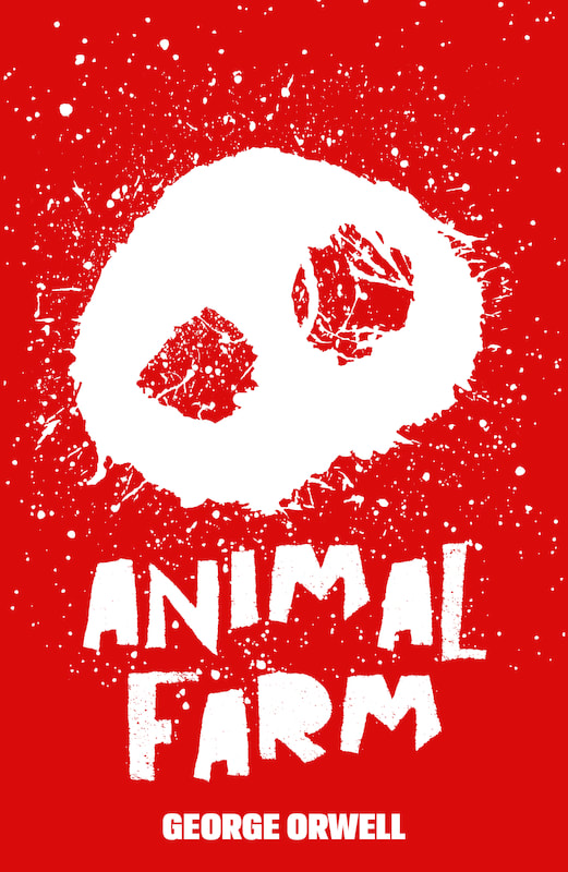
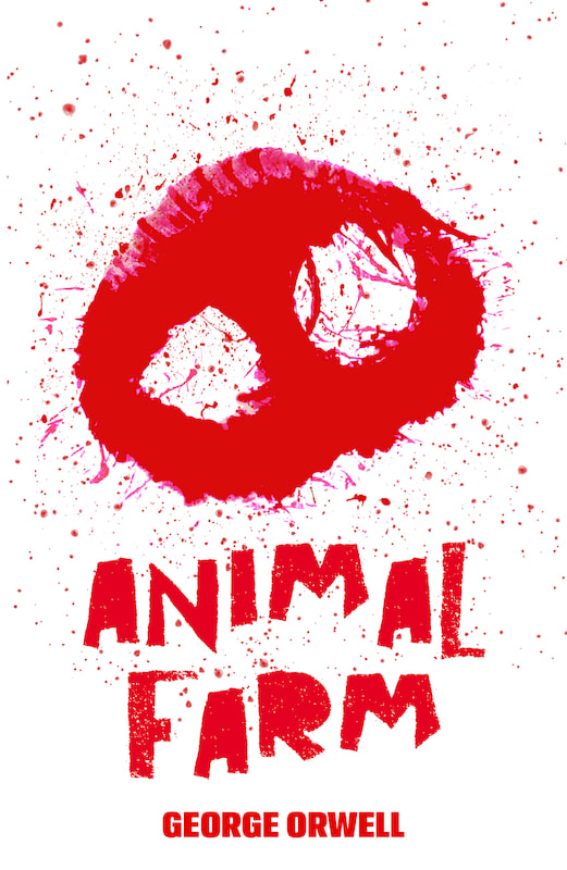
After my review with Paul and Vanessa I further developed my book by adding a mud splatter combined with the red splatter, this was to further relate the cover to the elements found at a farm such as mud. I have also lightened the opacity slightly behind the blurb of both covers as it means the splatters across the book doesn't make it any harder to read the book. These are my final designs and have now submitted these to the competition. I am really happy with my final choices and am glad I have done a live brief which I get to use a combination of page layout with illustration and typography. I think I am fairly good with page layout as I use it a lot in my day to day job working at a printers and think this made me more engaged with this brief as it was something I felt I had experience in, This project has made me want to apply for more competition briefs like book covers and will continue to build my portfolio of work I have done for companies.  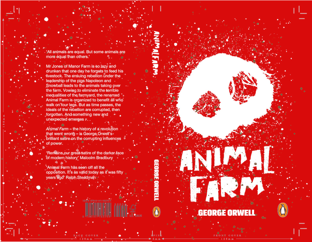
0 Comments
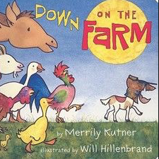
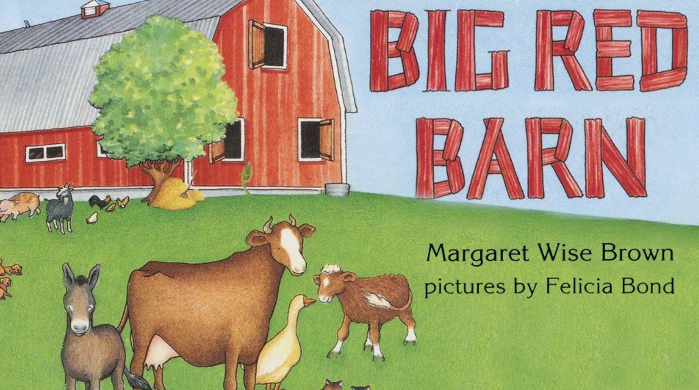
Using InDesign I dropped my artwork into just the front cover template so I can add the title text, Based on the previous designs I thought the font for Animal Farm could of been improved. I wanted to relate to the idea of animals and decided to use the font as seen below, This font gave a farm feeling to the book. I have attached two images of children farm books and think the child like nature to it gave it a clear relation to the fact it's based in a farm, I also think it contrast well with the blood covered book cover and it separates innocence from horror. I choose to then contrast the title of the book with a bolder font as I thought this would separate the author from the title very well, and as seen in the samples I know a bold font works best as it can be easily read and seen.
I have started off my design for my book cover in photoshop, I thought this software was the best from creating the image for the cover and then later using InDesign to create my layout with the text correctly. I have filled in the print with a more striking shade of red, during this process I also decided to do a reversed colour creating a white version on the red background. I think looking into the current Penguin designs it's more common to have a coloured background for their books, this is why I decided to do two version. I personally like the idea of the red snout as I think it represents the idea of splattered blood. Next I will add my design into the template given by the competition page so I can begin to understand how it will look spread out as a front, back and spine.
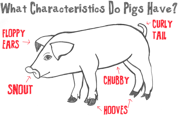 Focusing on the characteristics of pigs I created a few quick drawings below showing off the main features. Currently I am interested in the feet and the snout, Looking at images of these features I realised the foot prints can look slightly like other animals such as deers or animal hoofs. I have realised that people cannot generally understand what print is of a pig and therefore think I will continue with the snout idea as this is a more obvious feature of a common pig. 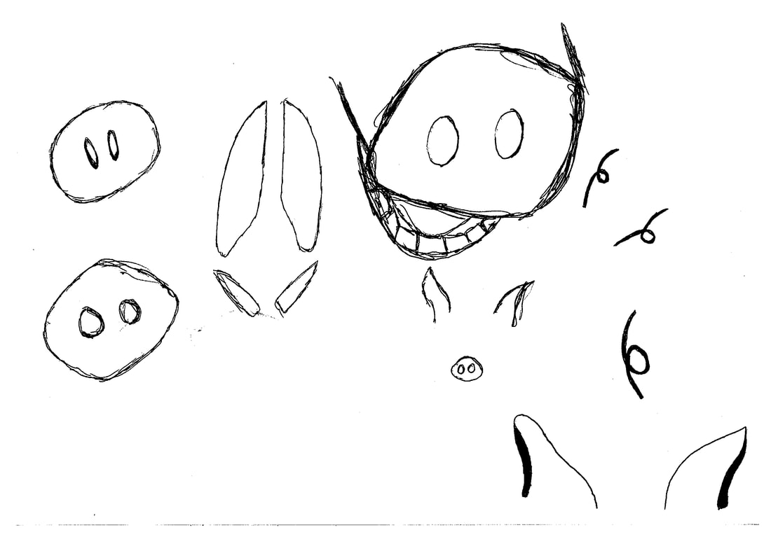
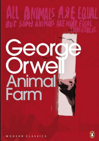
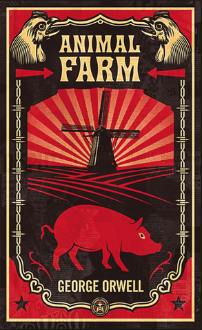
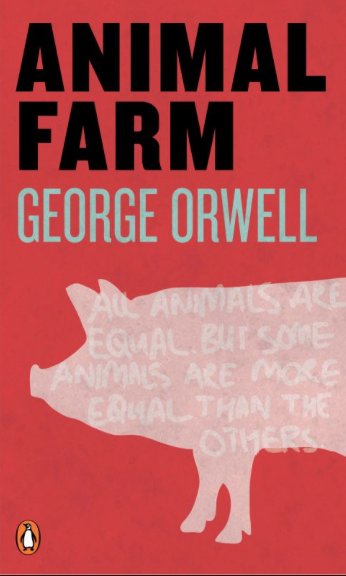
Below are three examples of the book Animal Farm, I have been looking at these for inspiration and also ideas on how I should create my own version. Based on these designs I have decided to look into features of a pig and focus on how I could manipulate them to produce a more thorough look into the main animal portrayed in the book.
We are looking for a cover design which will reflect the book’s status as one of the great modern political allegories of our time, as relevant today as it was when it was first published over 50 years ago. It is rich with ideas, characters, allegory, political and moral philosophy – read it and decide for yourself how best to showcase the content of this remarkable novel through your cover design and bring it to a new generation of readers.
Your cover design needs to include all the cover copy supplied and be designed to the specified design template – B format, 198mm high x 129mm wide, spine width 8 mm, incorporating the Penguin branding and all additional elements such as the barcode. Please refer to the Submissions Details page for full details of the spec and how to submit your entry. What the judges are looking for We are looking for a striking cover design that is well executed, has an imaginative concept and clearly places the book for its market. While all elements of the jacket need to work together as a cohesive whole, remember that the front cover must be effective on its own and be eye-catching within a crowded bookshop setting. It also needs to be able to work on screen for digital retailers such as Amazon. The winning design will need to:
|