 Final
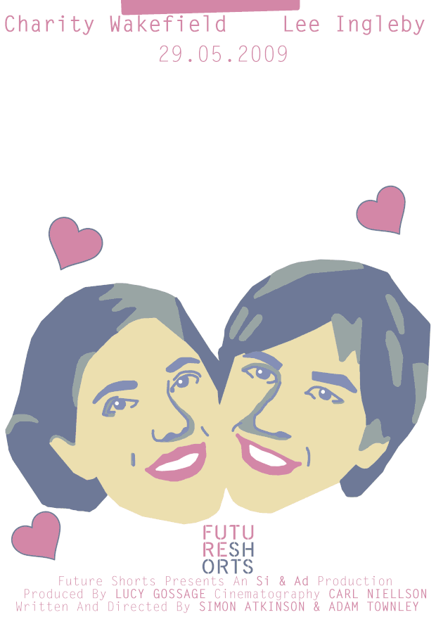
After presenting I came to the conclusion that this was my favourite one, it had a more thorough feel. The GIF above is the final edited version, I made the sticky note fall from the top and stick to the title, this made it more obvious that it was a sticky note in comparison to the previous one that didn't give off a sticky note vibe but rather a piece of fallen paper. I also added the logo from the film in the same colour as the rest of my project to show its relation from the short film to the GIF poster. I really enjoyed this project and showed me a in-between stage from a still image to a complete animation, this is a really interesting stage that I tried to create and is something that may be useful in the future.
0 Comments
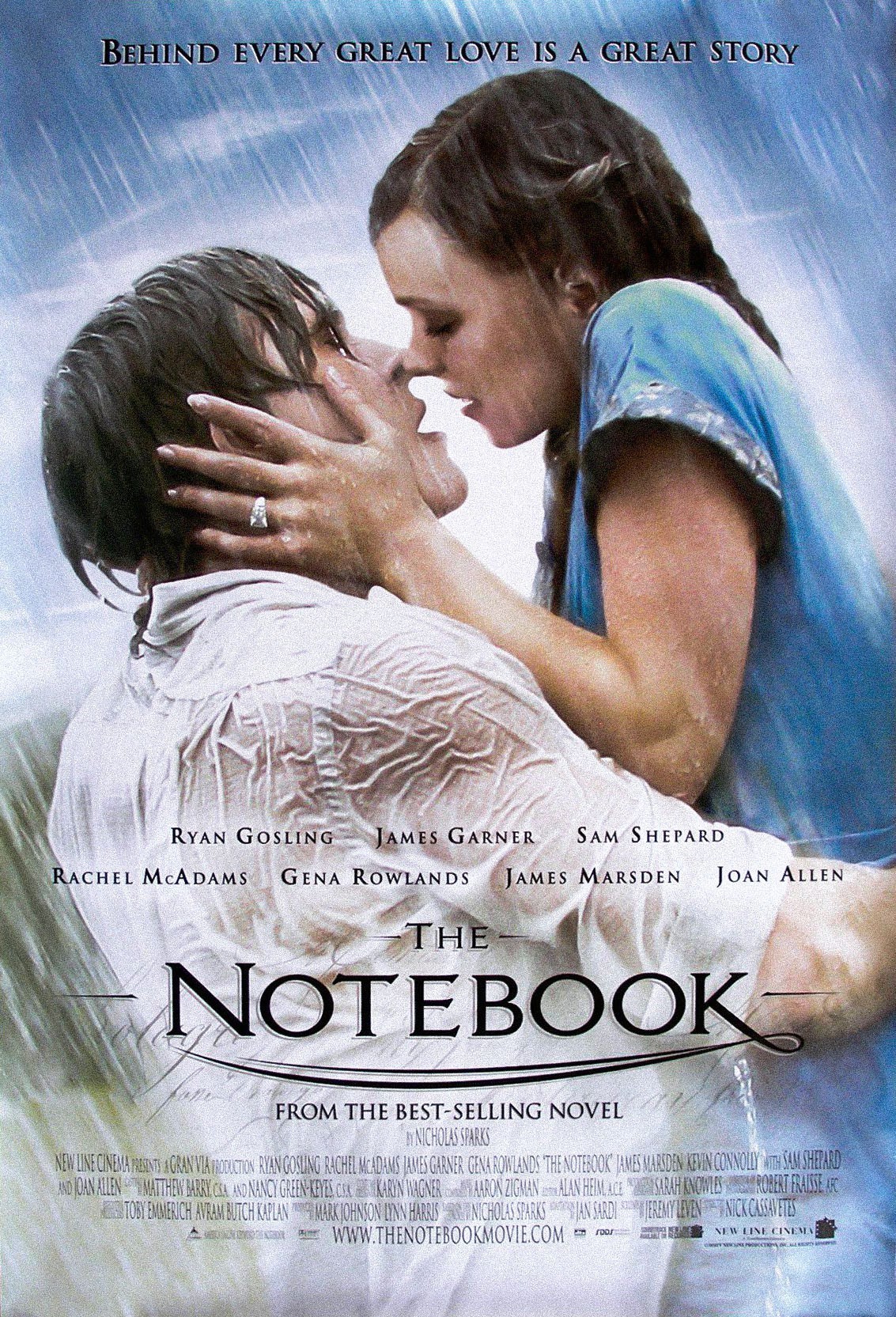
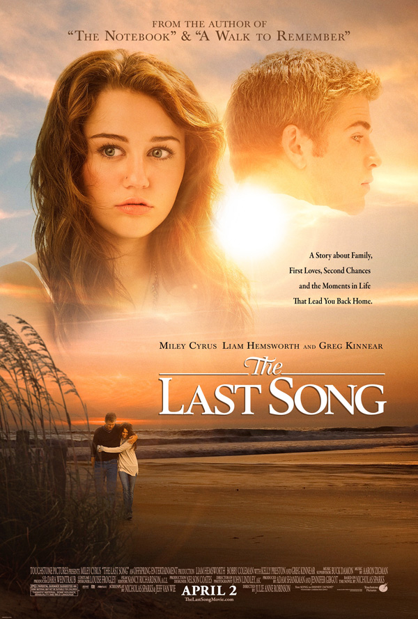
 This is the basis for my film poster(s), looking at previous film posters a lot of them include a variety of names who are credited for the film process. However, as this is a short film it actually consists of a very minimal people to credit, therefore I have only used the essentials in my posters - actor/actress name, directors and who it was written by. I have also included the release date and title as these are a must have in most film posters. When creating my film posters I used colours which matched the movie itself, these were mostly pink,blue and yellow, the colours were simply chosen due to the relation of the film and I thought having matching colours was a way to show a good relation. Once I had written all the descriptions on the film poster I then had to choose what type I was going to use, I had an idea for it to be a Serif font as I feel these styles relate to the traditional theme of romance. When looking for a perfect font I found Bodoni 72 Oldstyle Book, this font consisted of all the aspects I was looking for and thought it really showed that it was a love story. In the examples below of popular romantic films you can see how they all use similar fonts which are all Serif, I feel looking at these examples backed up my own knowledge of what a romantic font should look like.
 Creation Process After I created a outline for my film poster on how I wanted it to do be laid out, I created this image of the two main characters its taken from the end image from the short film and I redesigned it in my own style. I then focused on how I wanted a post -it- note to fall from the title to the bottom of the page. I began taking images/videos of me dropping a post -it- note so I could work out the dynamics of how it would fall naturally. I decided the most accurate way to do this was to insert the video of the post-it-note falling in slow motion in front of my image and redraw over it so it gives the most realistic effect, the original video of me doing this is shown below so you can see the relation of how I took it from this and recreated it to go over my image. Once I had done this I had to put this into motion which allowed me to show the note falling as well as creating multiple hearts pop up, which I feel just backed up my romantic theme. 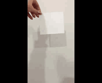 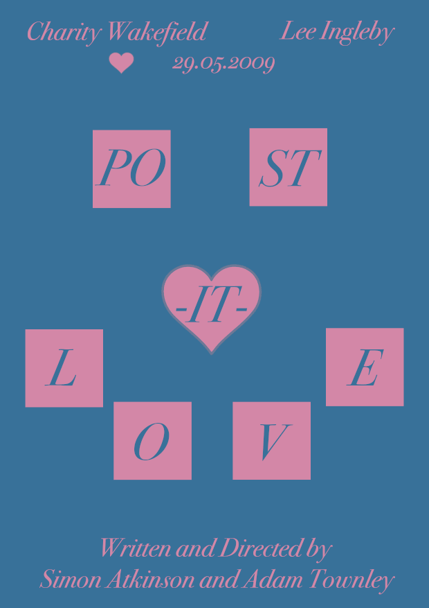 Creation Process
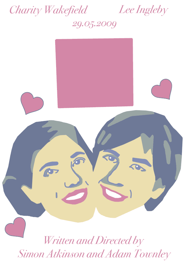
I created this second poster in mind of having a simpler design to my first one, I wanted to see the contrast between having a design which may give a little to much off about the film along with this one which told people very minimal about what happens in the film itself. I used pink squares for the text to go in to represent pink post -it- notes, in contrast I used the blue background which was designed from the first post -it- note image we see in the film. As I was solely focusing on minimal design, I decided to use the heart taken from the first poster and create a flashing effect behind the centre point of the title, as well as having 4 1/2 hearts show up one my one at the top to represent the amount of stars it was given in a review.  My second poster I am designing is going to be a minimalistic poster. I have been looking at artists such as Alex Mathers and Eder Rengifo, these designers have executed perfectly what I would expect a successful minimalistic poster to be. Combining a two/three piece colour pallet relating to the film as well as using one singular image to tell the whole movies story was undeniably genius! It has such a effective power using this style and has inspired me to creating my own. As this movies main subject Is post it notes, I am going to use the first picture created from the notes from the short film as my basis my film poster. to the right is a screenshot of that scene so you can see the relevance in my poster once designed. This one will be relatively short and will consist of the same two tone colour pallet as the other artists i've seen have done as well.
Above is Eder Rengifos minimalistic film poster interpretation. I admire his work as this has had a massive impact on how I am designing my own poster. However in his work he has only used the film title and who it is by, this little information isn't ideal for a short movie, especially mine as there are only two people who wrote as well as directed the movie, and therefore will include the same information I used on my first poster. Though as this is going to be a animated poster I have decided to take the star review from http://www.filmsshort.com and use that in the form of love hearts to show the movie rating. I feel like by doing this it may make the film more desirable to watch, simply as the creators are not very known it will show the audience that the short movie has had a high star rating for four and a half and therefore is worth a watch.  http://jamathers.com/92iui3rn9wq3gep31kxhlb0ko8t8og http://jamathers.com/92iui3rn9wq3gep31kxhlb0ko8t8og This film poster for the movie Dumb and Dumber is created by Alex Mathers, he is a illustrator who has done a variety of work, one being minimalistic film posters. I feel his work is slightly more relevant as he has used slightly more typography in his work in comparison to Rengifos. Mathers has also used more detail in his work, such as the shadow effect on the hats and the details of the cross in the bow, although I do think this is a much more effective way to to show the poster as I feel it makes it more realistic I feel for a post it note this wouldn't be relevant, and therefore will create the image in the style of Rengifos.
Post-it-love (2009) Staring- Charity Wakefield and Lee Ingleby Directors: Simon Atkinson and Adam Townley Writers :Simon Atkinson and Adam Townley IMDb synopsis - Girl meets boy in quirky office romance. Two like minded souls, too shy to approach each other, find a new way to show their love for each other. Reviews http://www.filmsshort.com/short-film-pages/post-it-love-si-and-ad.html#.WCxU7ZOyNBc 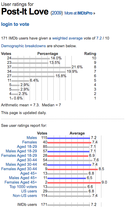 http://www.webdesignerdepot.com/2011/02/7-elements-of-a-great-movie-poster-design/
I found this website which I thought was a good start for learning how to create my poster, it told me about ways to create a effect poster and I feel it will help me during my creation process. One element thats spoken about it showing not telling, I feel this may be something I will play around with by creating a couple of designs which show off the film in a more/less obvious way. Looking into post it notes, I stumbled across this on youtube. its a 1:54 minute video using stop animation to create the illusion of moving post it notes becoming a range of things such as, a game, a window, a road and many more. I am considering of creating a quick realistic poster in relation to my two other cartoon styled ideas, in this poster idea I am thinking of having a range of pink post it notes screwed up which in a stop frame animation it gets larger and creates a beating heart effect. I feel this will be a nice contrast to my other ideas and show the physical form of my main asset- the post it note.  Starting to look into moving film posters I came across Buzzfeeds 17 Movie Posters Improved With Animation
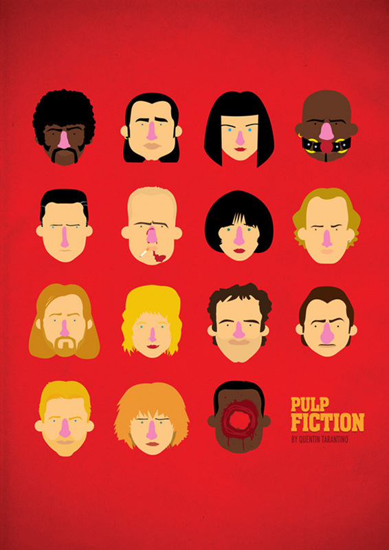
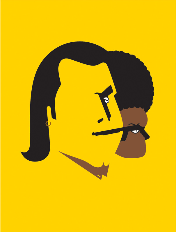
(https://www.buzzfeed.com/erinlarosa/movie-posters-improved-with-animation?utm_term=.xjD3ZNbo3#.qrWk49B6k) . I found this website really helpful as it showed me examples of posters which I could see as a non moving poster, though bring a whole lot more to the table when animated. I feel this has impacted my thoughts and ideas for this project as its given me inspiration. Looking at movies posters on http://www.howdesign.com/design-business/design-news/26-great-movie-posters/. I have come to the conclusion to make two/three posters, this is because I'd like to take three different approaches. First will be to use this image taken from the movie and recreate it along with the suitable text. Now from a group discussion I have realised that this might be a realistic approach and give to much of the film away, however I think it will create a satisfying animation and therefore will create this one. I am also considering of using one of the post it notes images they make in the movie and created a poster from that, referencing to the movie but not giving anything away! Lastly I am considering taking a non cartoon approach and using real post it notes to create a beating heart, relating to the love shown in the movie as well as showing other ways of working and showing my creation process.  Looking into moving posters I wanted to firstly look at those which don't move. I have realised that the animation is meant to be subtle and therefore am going to look into ways I can design it as a poster and think of the animation after my idea process. I am beginning to look at cartoon styled posters, I enjoy creating work originally from photography using digital techniques to draw over moving images. I have found this designer Olaf Cuadras, his a illustration artist who reimagines movie posters such as Pulp Fiction, Borat, Zoolander and many others. I am interested in the way he draws his characters and creates these interesting posters. His work similarly reminds me of Ali Graham, who is a illustrator living in Hastings, Grahams work uses similar techniques which you can see below where I have compared Cuadras (right image) along with Grahams (left image). I feel their works consists of similar colour pallets and focuses on simplicity. This is something I would like to explore also in my work.
I have decided to create a few animated posters for this short film. My first idea is to recreate the end image in this film of the two characters, adding a romantic font and using flashing hearts as my animation. My second idea which is less of a give away is to use a smiling face which is seen as the first pot it note design in the film, this will also have animated hearts as the moving part of the poster. Lastly, I am going to create a realistic poster using stop animation of real life post it notes being altered to create a beating heart effect. After watching all the short films, I have chosen two options. First is 2+2=5, this is a film that I felt had the most powerful message. It focused on the role of what brain washing can do to a society, and how people will willingly go along with a rule(s) that are obviously wrong but because of who they are being portrayed by they do it anyway. This is taken place in an all boys school, throughout there are references to Adolf Hitler and the Nazi symbol, relating even more to controversy . I do think this is the most popular film being picked and seems from my group crit, that most people have very similar ideas for this project, therefore I have decided not to go through with this. I enjoy creating interesting designs which fun and cartoon styled. I feel choosing Post-it-love will be a good option, as it has a lot of elements which I can be fun and creative with as well as being able to design a short animation which not only will represent love but also myself and the way I like to design from a brief.
Design an animated film poster for ONE of the short films listed on this brief. We suggest that you watch them all before deciding on which one to focus your efforts on.
FILMS: The Lunch Date -Directed by Adam Davidson https://www.youtube.com/watch?v=epuTZigxUY8 The Beachcombers https://www.youtube.com/watch?v=4L_wgw0cr2I About a Girl https://www.youtube.com/watch?v=JV1_TXm0XHs 2+2=5 https://www.youtube.com/watch?v=EHAuGA7gqFU I Do Air https://www.youtube.com/watch?v=USvsDwfEekI Eight https://www.youtube.com/watch?v=zlYzsIYP6GE Post-it-Love http://www.filmsshort.com/short-film-pages/post-it-love-si-and-ad.html#.V-rE15MrJYg Graphic Designers: We will be looking at your skills in layout, typography and your ability to choose and animate an image that communicates the film effectively. You may create/source the images that you animate in anyway that you choose. Designers, illustrators & movements to explore: Saul Bass Toulouse Lautrec Stenberg brothers German Expressionist film posters Alan Aldridge Paul Rand Milton Glaser Drew Struzan Bob Peak Olly Moss |