Below are three fonts which I think would be a successful choice for the app, I like the simplicity of the bottom two as it's easy to read and Is not like any other font's I have seen currently being used for popular apps. I am also considering Giddyup which is the font at the top of the image below, this one would work in with my current logo design as it compliments the curves in the lace of the music note. However I am unsure to use this one as it is quite 'girly' and feel it may not relate well to the original idea behind the app which focuses more of styles of dance like Hip Hop which is a hard hitting style. I think I will continue with 'Toronto Gothic' the bottom font, then after feedback from my tutors and peers I will be able to conclude if this is the font to proceed with. 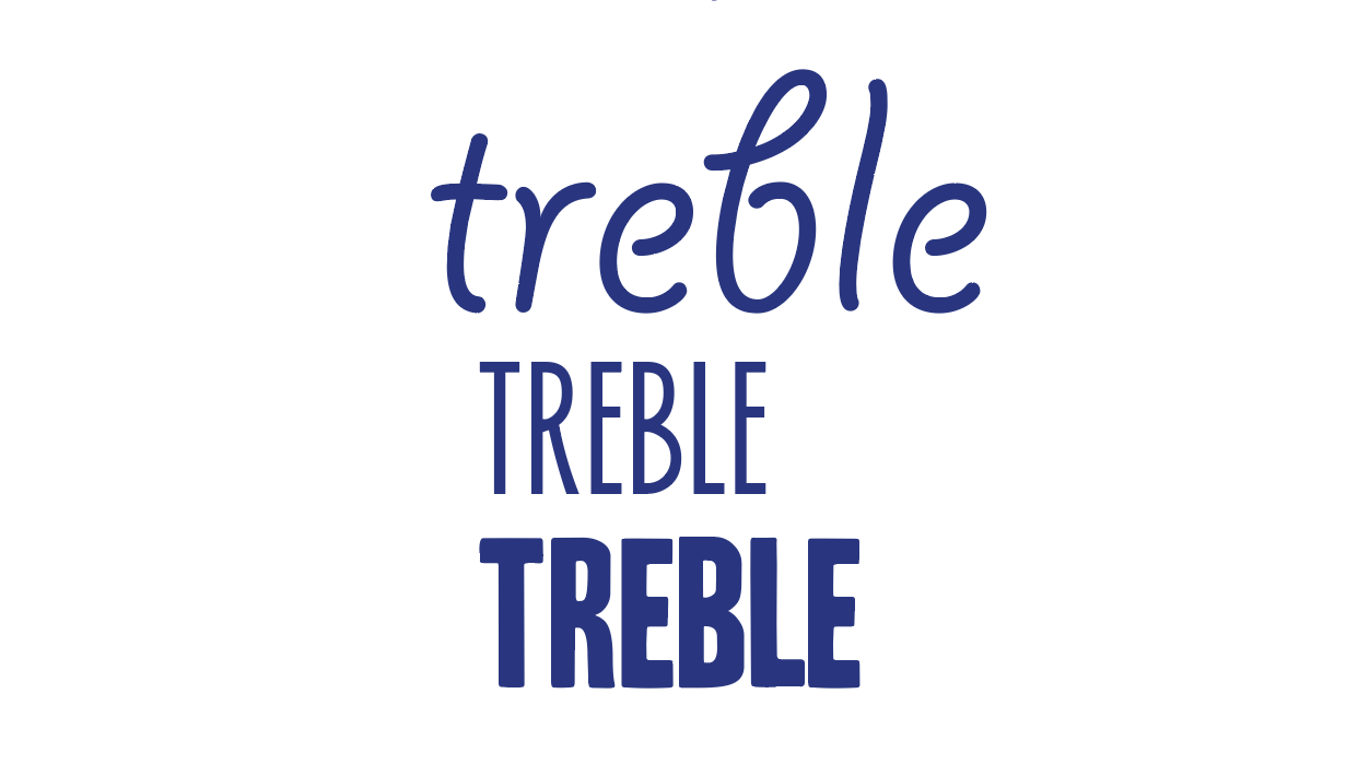
0 Comments
Leave a Reply. |
